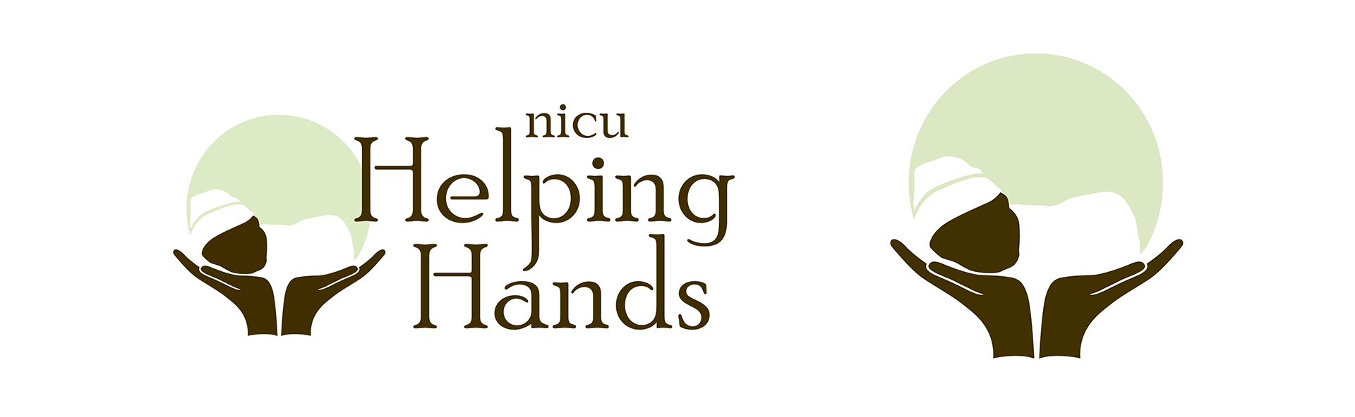
Created the NICU Helping Hands logo and visual identity, establishing a warm, trustworthy brand system built around clarity and emotional care. That foundation guided the design of their print and digital materials for many years.
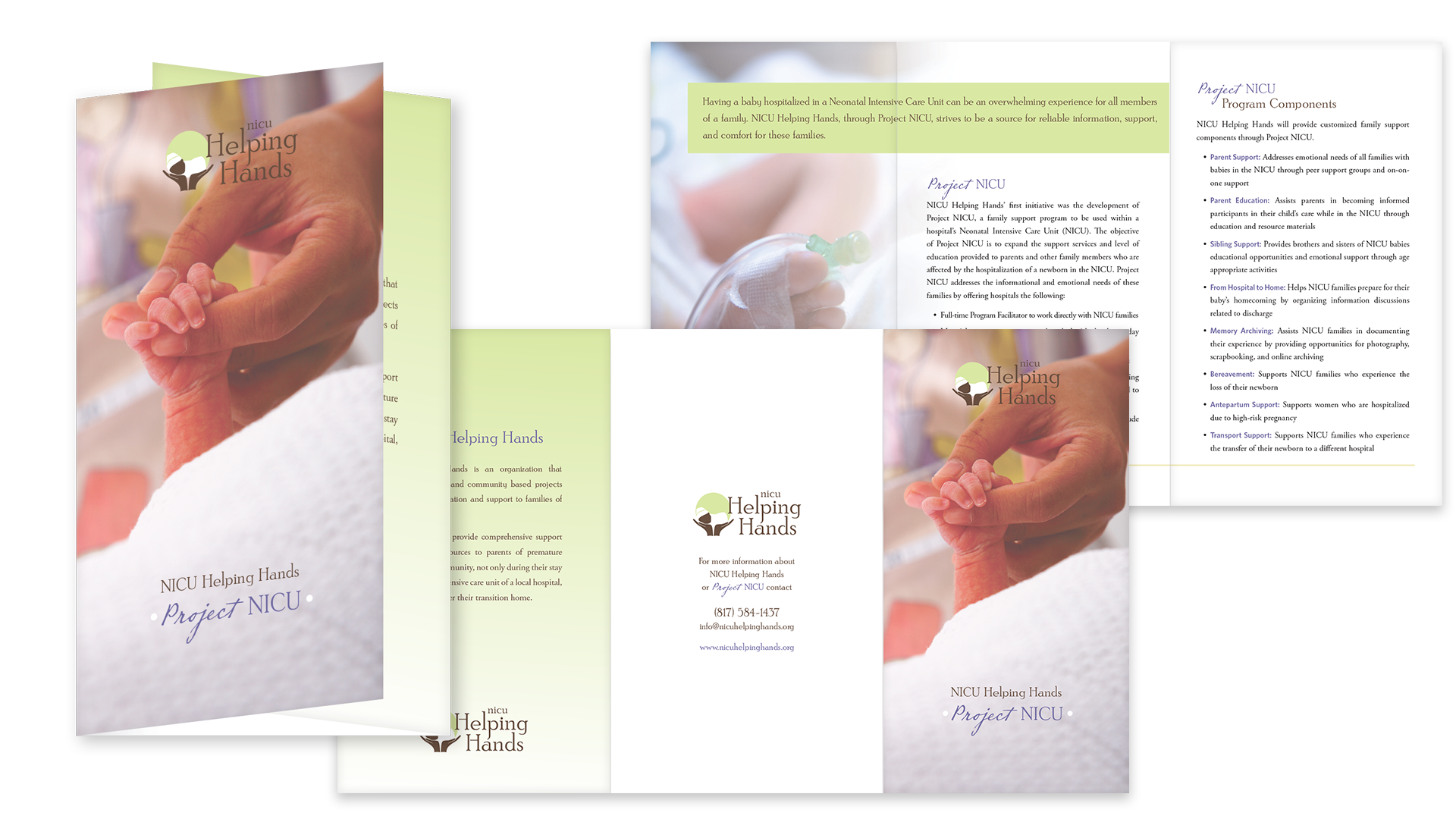
A calm, supportive brochure designed to introduce Project NICU with clarity and compassion. Soft gradients, warm photography, and a clear typographic hierarchy work together to make sensitive information accessible for families and hospital partners.
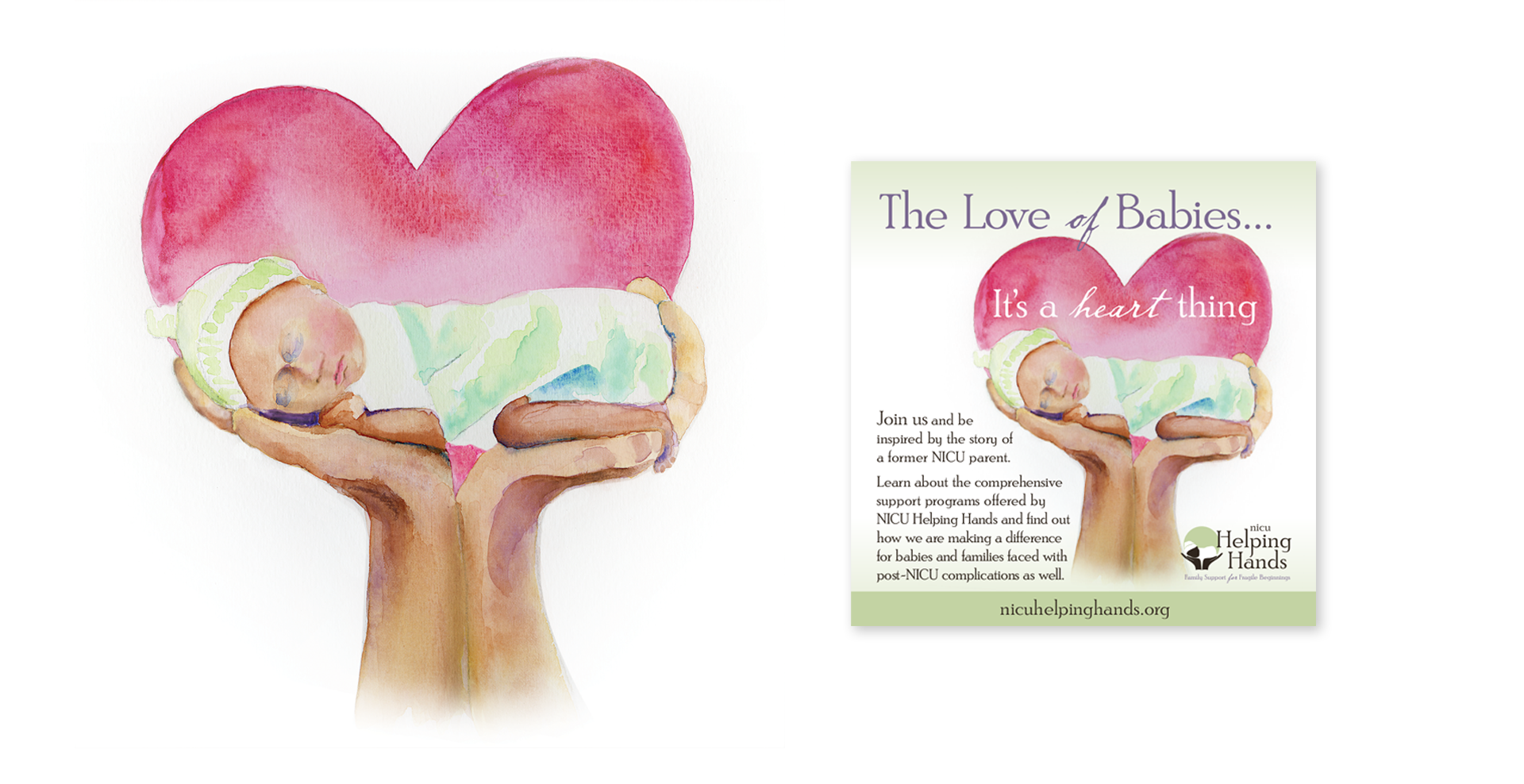
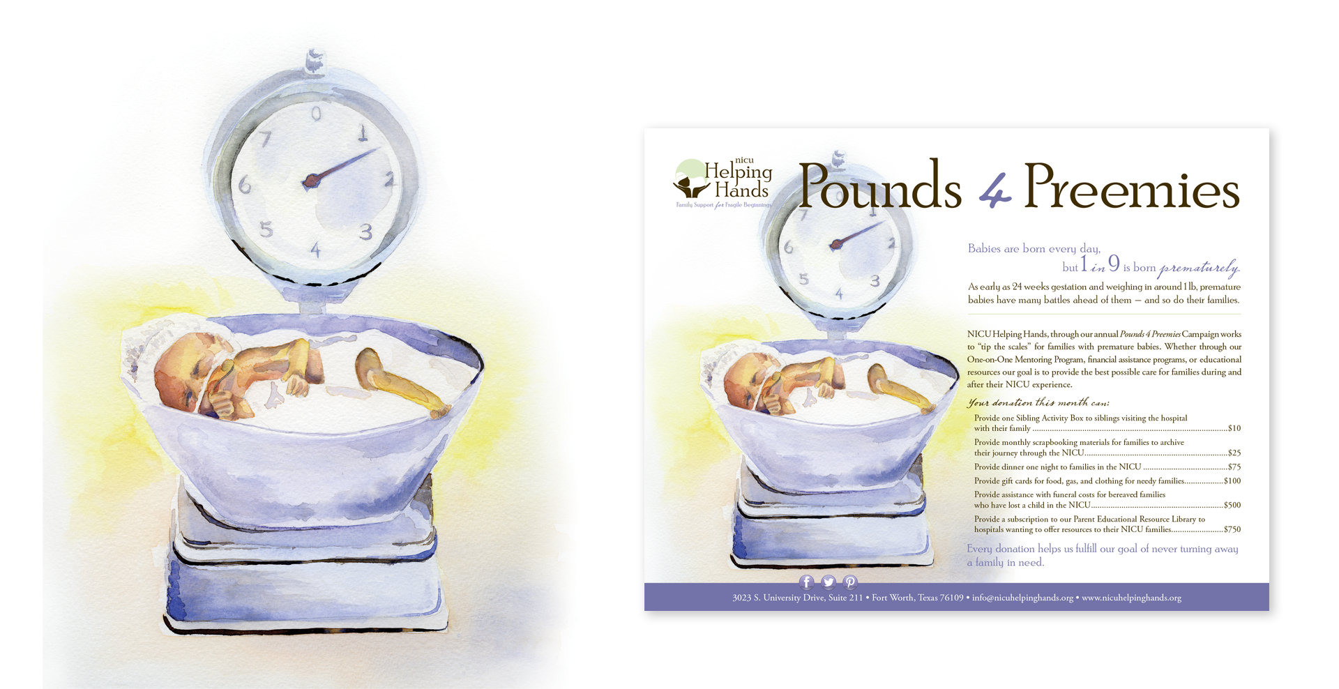
Expanded the NICU Helping Hands brand with custom watercolor illustrations for campaigns including The Love of Babies and Pounds 4 Preemies. These hand-painted pieces echoed the brand’s soft palette and warm tone, adding emotional depth and a cohesive, personal touch to the organization’s outreach.
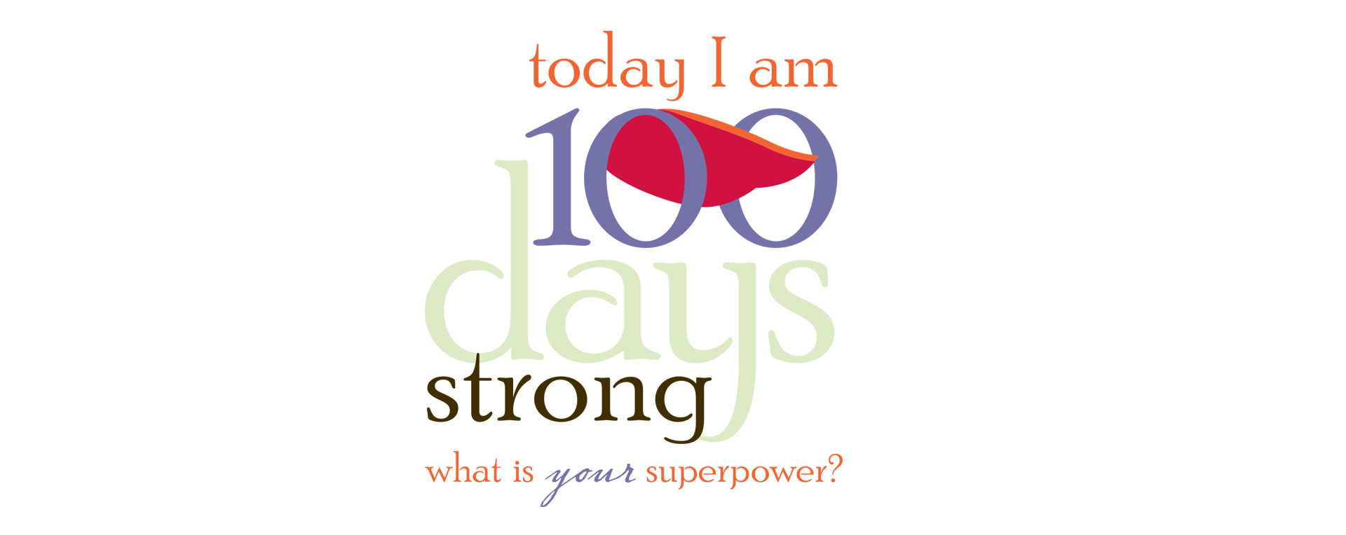
Designed to celebrate a powerful NICU milestone, this 100-days graphic pairs bold, cheerful color with a subtle superhero cape — capturing both the strength of preemies and the spirit of the families who champion them. The typography and palette keep it connected to the larger NICU Helping Hands brand.