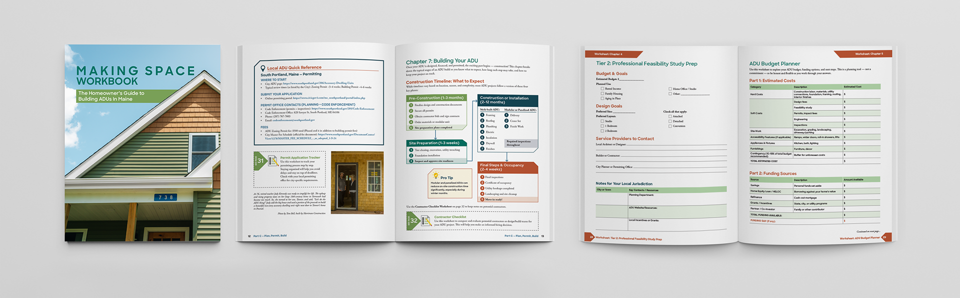
Making Space Workbook — The Homeowner’s Guide to Building ADUs in Maine
Designed through 19 Oaks for Backyard ADUs, this comprehensive homeowner workbook transformed complex zoning, permitting, financing, and construction information into an accessible, step-by-step interactive planning resource. Three location-specific editions combined practical resources, fillable worksheets, linked navigation, and city-specific content to help Maine residents confidently explore and build accessory dwelling units.
Holidays of Hope Gift Catalog — Tarrant Area Food Bank
Designed a donor-focused holiday gift catalog that paired real community photography with custom illustrations to highlight the impact of TAFB’s programs. Each spread translated a core theme into a warm, approachable visual story that helped donors understand where their gift could make a difference.
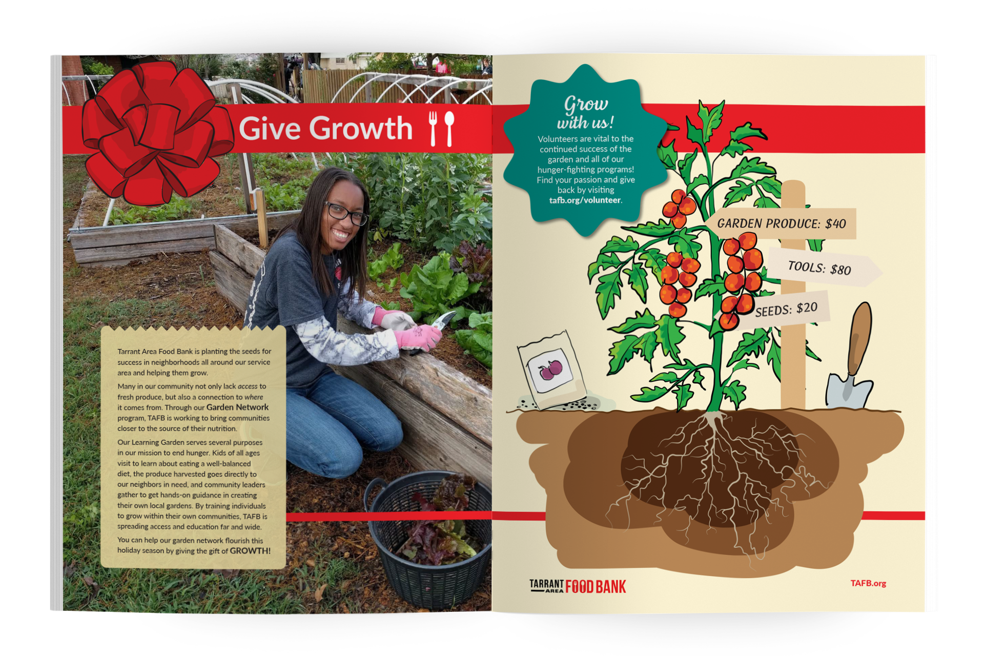
A hand-drawn garden illustration anchors this spread, showing how community gardens and education programs cultivate long-term access to fresh food. The design combines real garden photography with bright, inviting illustration to emphasize growth and possibility.
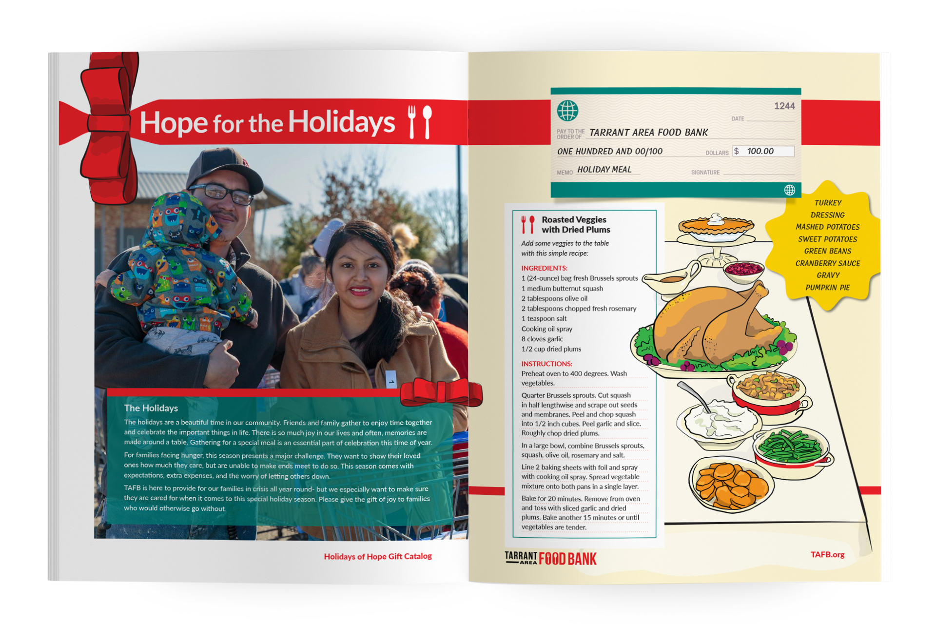
This spread blends a candid family photograph with a recipe and illustrated holiday table, creating an emotional connection to the seasonal meal donors can help provide. The layout focuses on warmth, tradition, and the comfort of gathering around food.
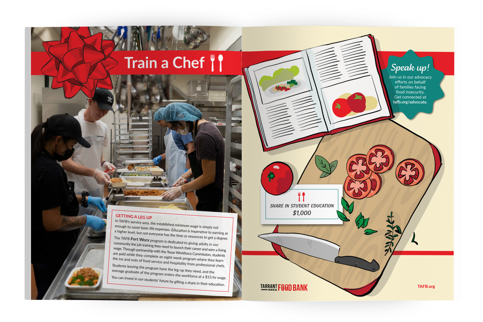
For TAFB’s Fort Worx culinary training program, I created a top-down kitchen illustration featuring tools, ingredients, and a cookbook. The design conveys skill-building and career opportunity, supporting a narrative about empowering adults to earn a living wage.
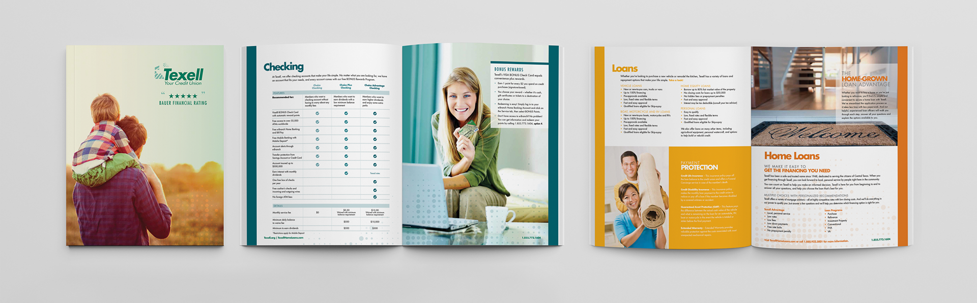
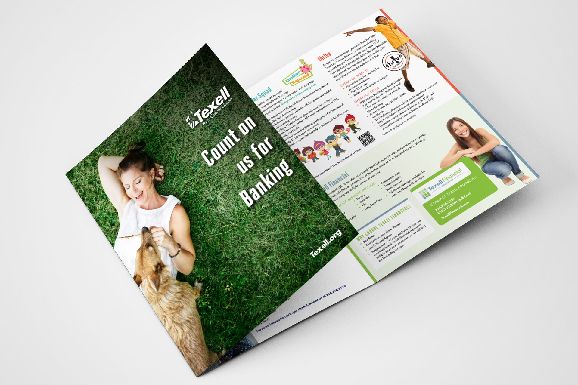
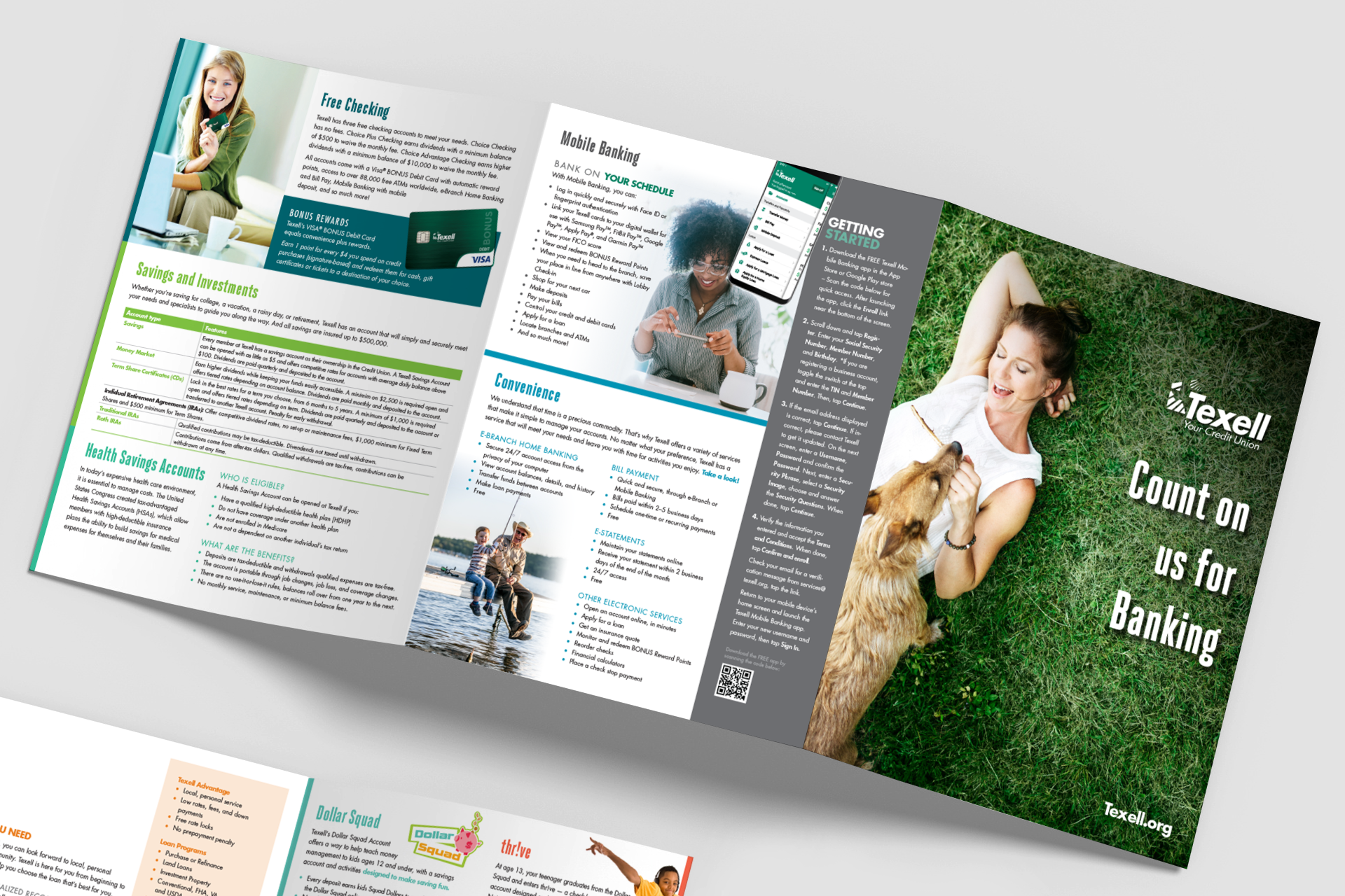
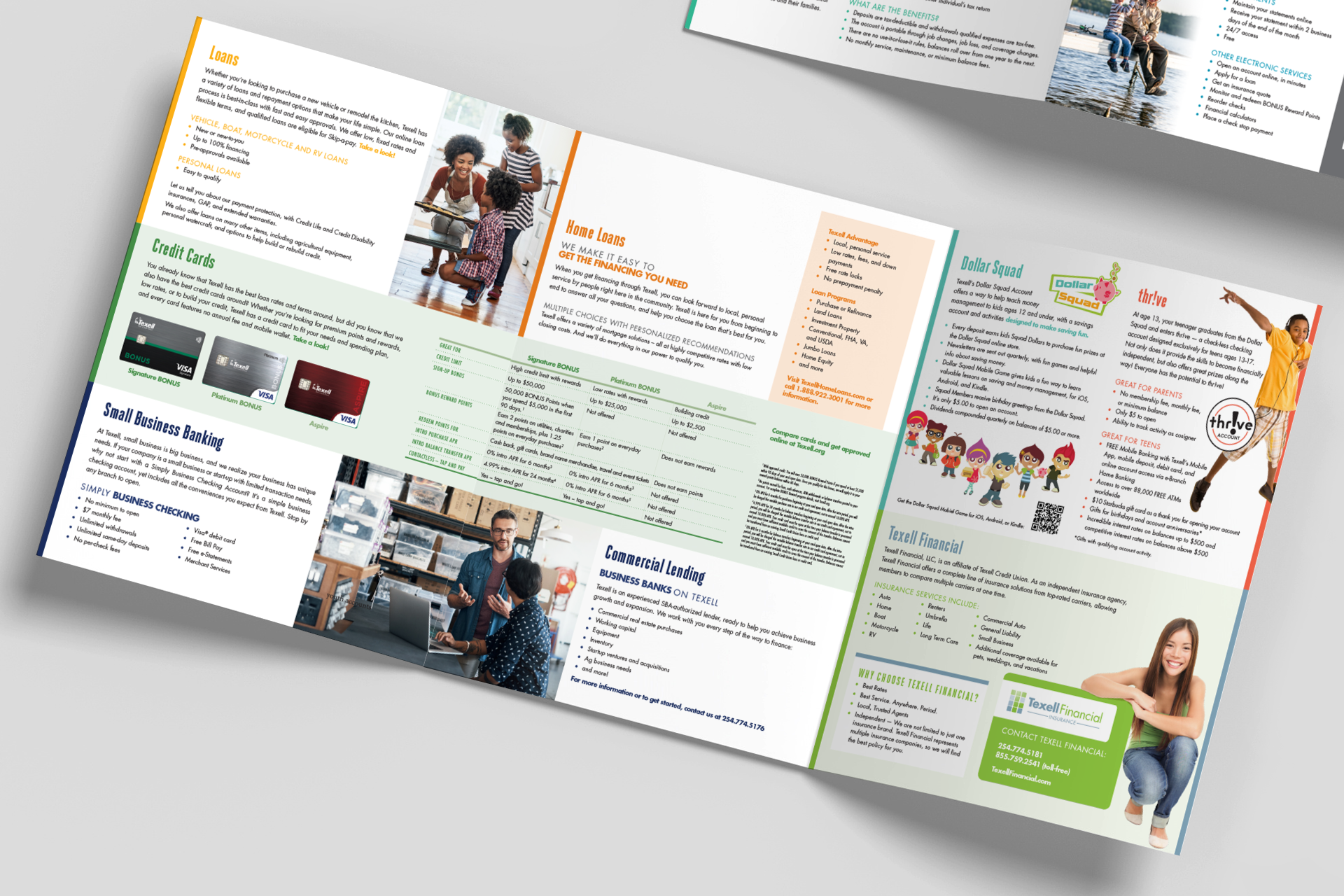
Texell Credit Union All-Inclusive Brochure
Texell Credit Union’s branches relied on a wide range of brochures to introduce members to their full suite of products — checking and savings options, youth accounts, credit cards and loans, investment services, and insurance offerings. To create a more cohesive and user-friendly experience for new members, I designed a unified welcome package: a custom pocket folder with a stitched 16-page booklet that captured all product information in one clean, organized piece. The folder included dedicated space for membership documents and a business card, ensuring the entire onboarding experience felt intentional and professional.
As Texell expanded its offerings, the booklet became costly to update and reprint. To create a more flexible, sustainable system, I led a redesign that transformed the booklet into a large-format trifold brochure and reimagined the folder as a stand-alone piece with dual pockets. This allowed us to print the folder in volume while updating the brochure in smaller, more cost-effective runs.
Because all detailed product information also lived on Texell’s website, the new brochure served as a clean, high-level introduction that guided new members to explore deeper online—delivering a modern, streamlined onboarding experience that was easier to maintain and more budget-friendly.
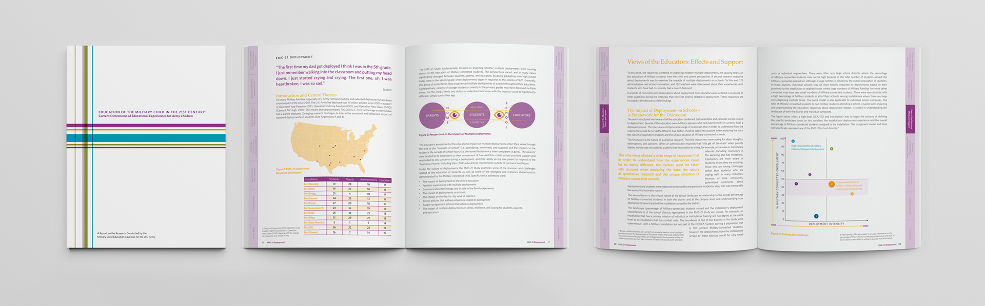
Education of the Military Child Research Report
Designed the Education of the Military Child in the 21st Century research report for the Military Child Education Coalition, creating a clear, structured layout for a complex qualitative study. The publication needed to support dense text, interview excerpts, and data visualizations while remaining approachable for educators and policymakers. I developed a clean grid, disciplined typography, and a color-coded tab system to guide readers through the report’s major themes.
These selected spreads and the cover highlight the report’s structured, research-driven design and my approach to long-form, information-heavy publications.
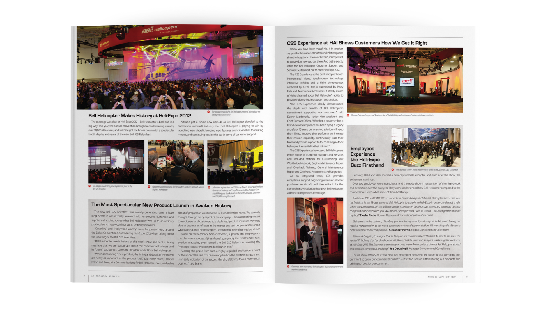
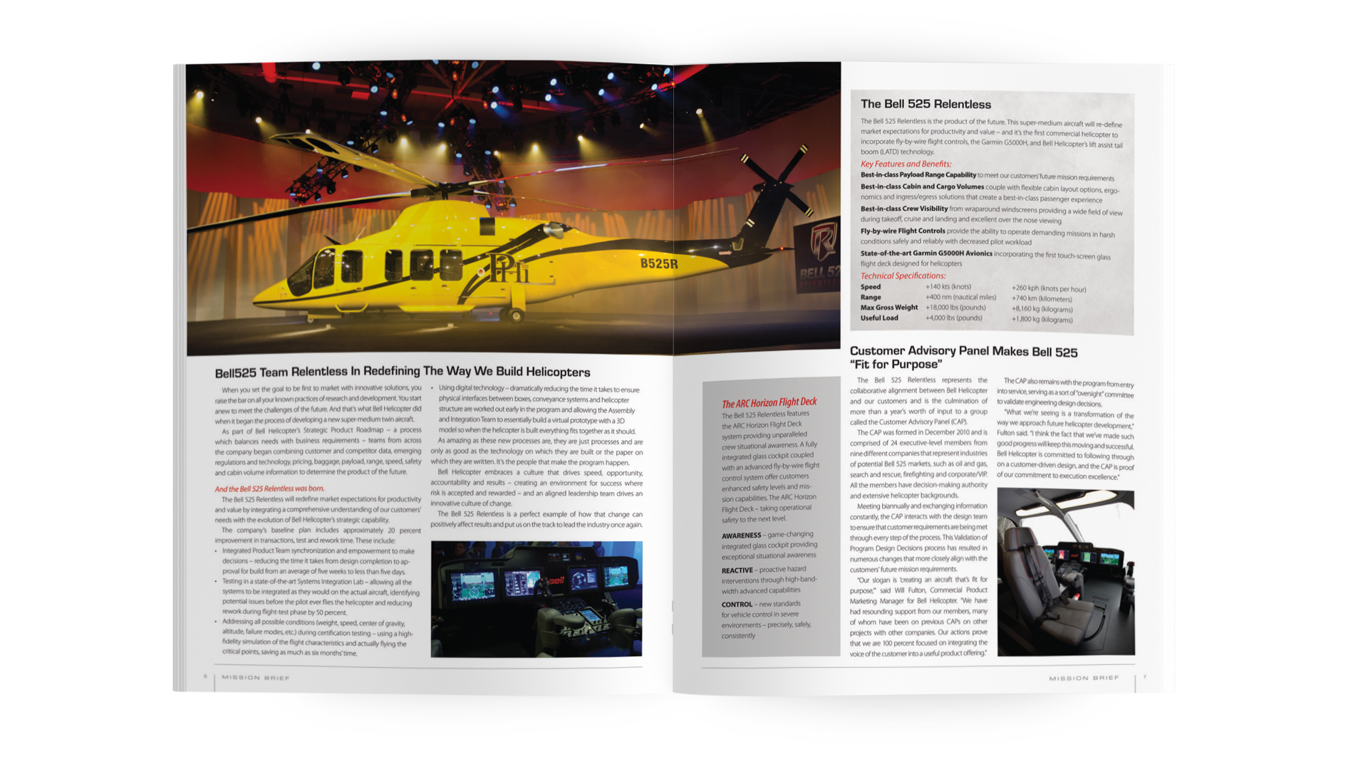
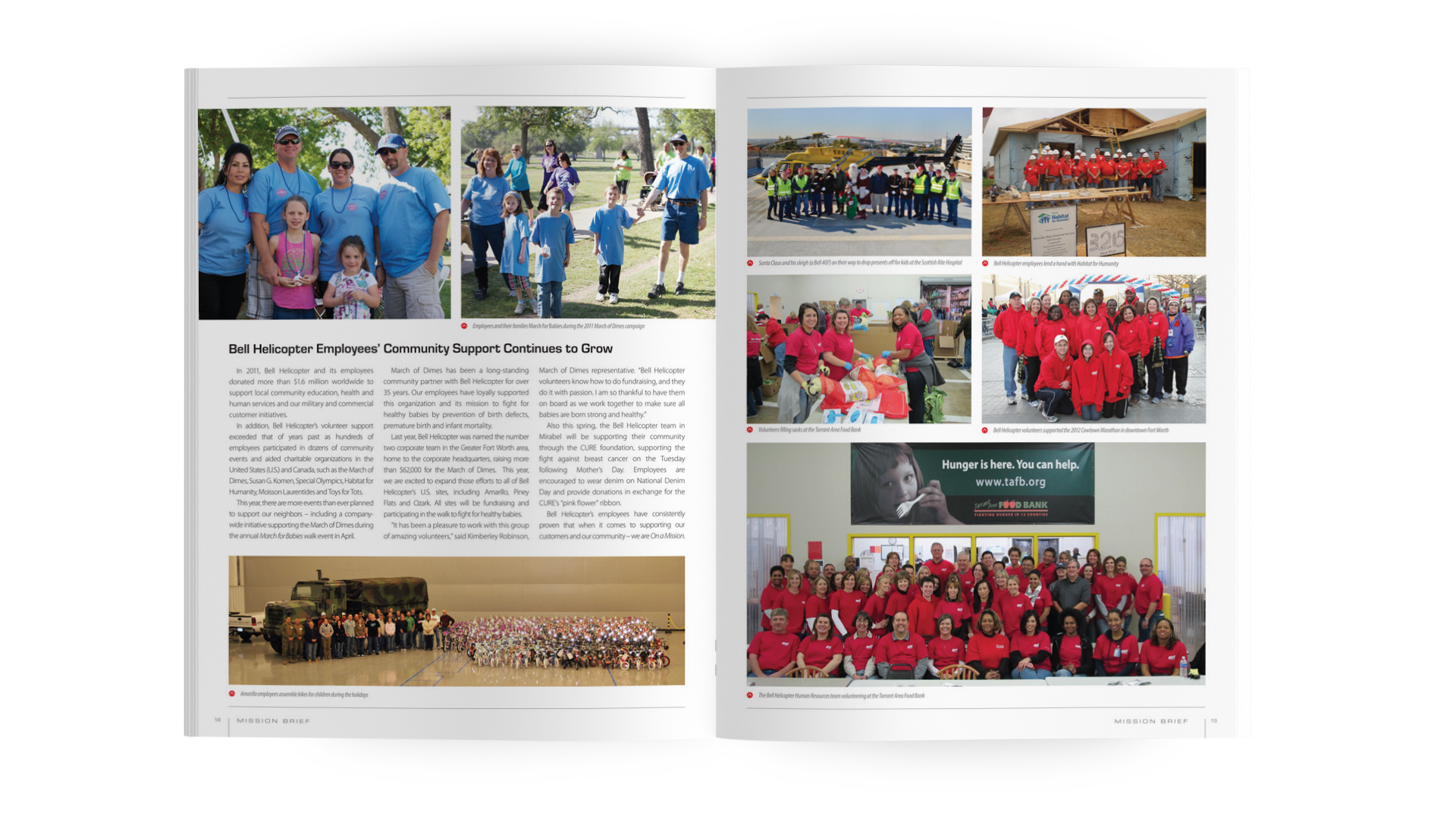
Bell Helicopter Corporate Magazine
Served as a freelance designer for Pavlov Agency, supporting their work on Bell Helicopter’s corporate magazine. The brand system, typography, and visual standards were already established; my role was to translate those guidelines into polished, high-volume editorial layouts. Working within a tight structure while managing complex content — multiple articles, technical data, captions, and photography — I helped produce clear, balanced spreads that reinforced Bell’s precision-focused brand. These selected layouts highlight my experience executing corporate editorial design that is consistent, organized, and visually engaging.