From expressive nonprofit identities to clean, modern wordmarks, this collection highlights the range and flexibility of my logo design approach.
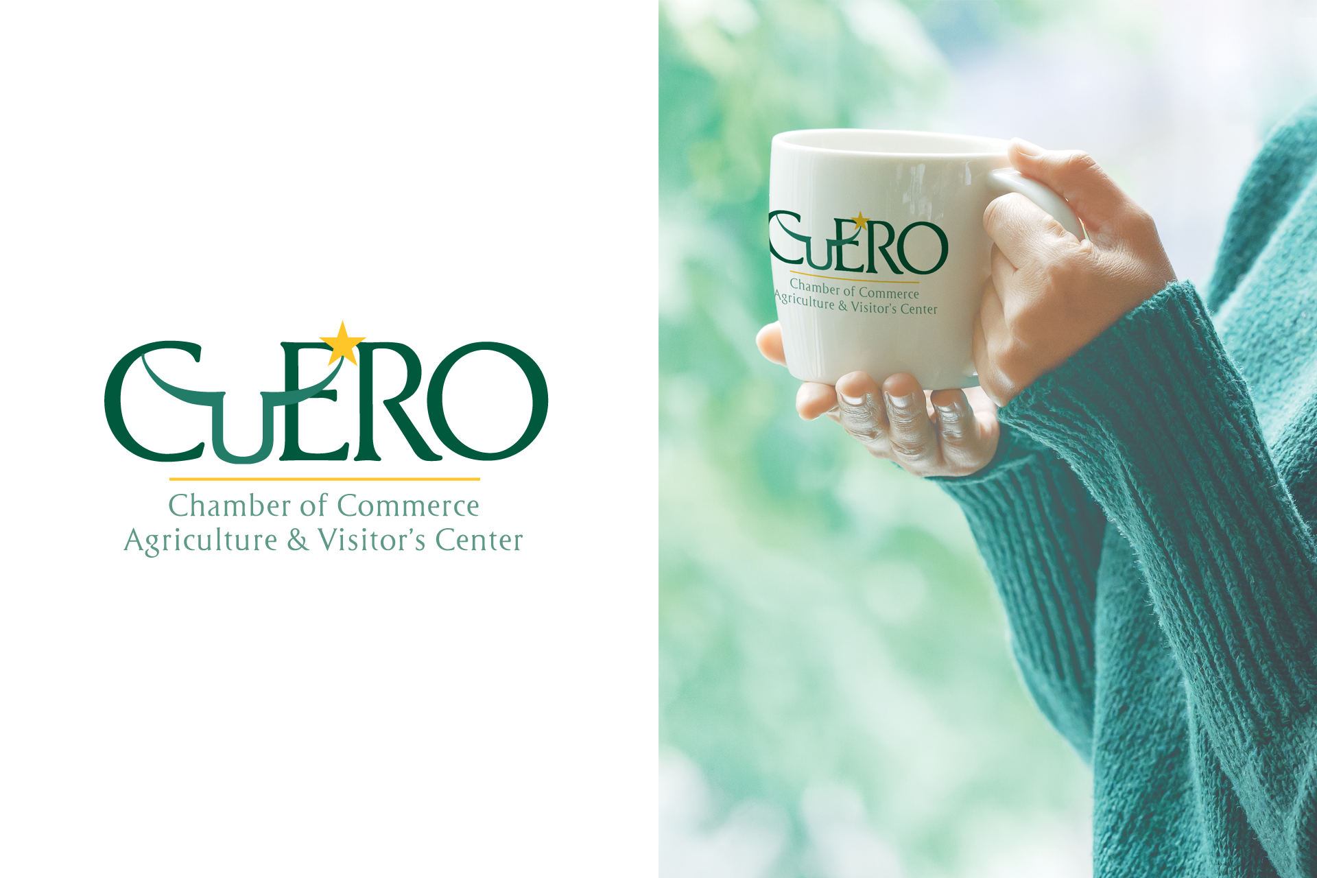
Designed for the Chamber of Commerce, this logo captures the charm of Cuero’s historic downtown while emphasizing a distinctly Texas identity. The longhorn-inspired “U” and the gold star offer a playful nod to state heritage, creating a welcoming mark the Chamber continues to use.
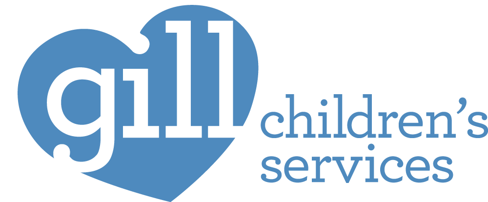
Created for an organization that provides last-resort funding for unmet needs of Tarrant County children, this updated logo replaces a dated puzzle-piece mark with a cleaner, more welcoming identity. The heart-shaped form and rounded letterforms convey care, stability, and accessibility, reflecting Gill’s long-standing commitment to helping children when no other resources remain.
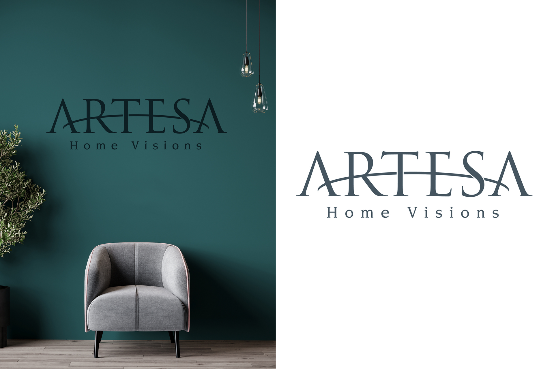
Created through an extensive exploration of styles and iterations, this elegant wordmark features bespoke letterforms and a sweeping crossbar that reflect the company’s focus on refined home design and architectural vision.

A personal passion project, this logo came from a running joke in my family about our many “UFO” (unfinished objects) sewing projects. The stitched script captures the idea behind Sew Finished — a hypothetical service that would lovingly complete unfinished quilts, knits, and other handmade pieces for people who needed an extra hand.
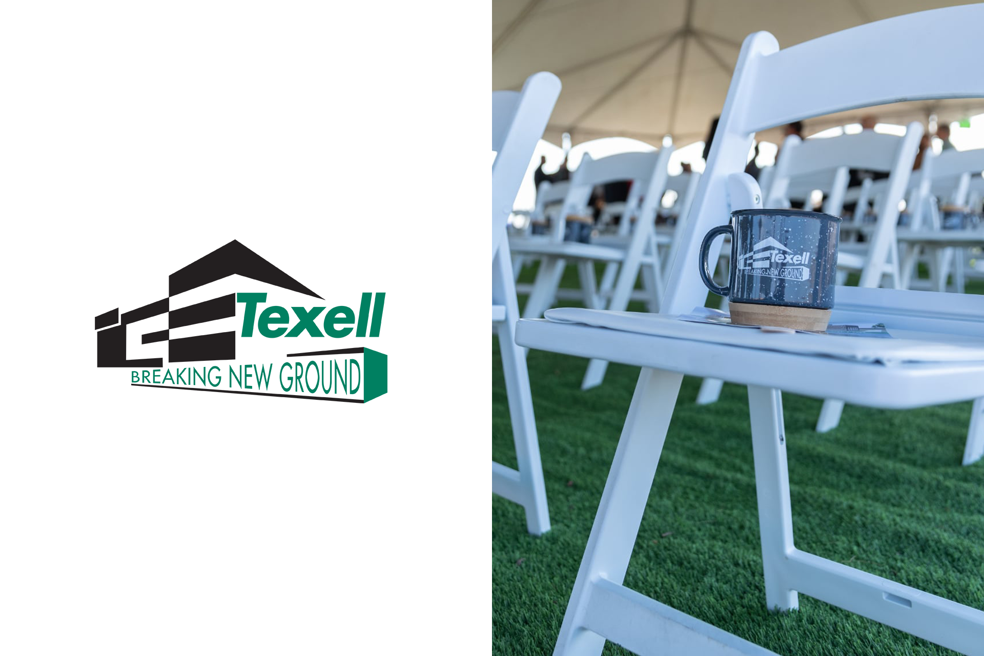
Created for the groundbreaking of Texell’s new headquarters, this mark incorporates the building’s architectural lines to symbolize growth and forward momentum. The bold geometric forms and dimensional base reinforce the theme of “breaking new ground” in both vision and scale.
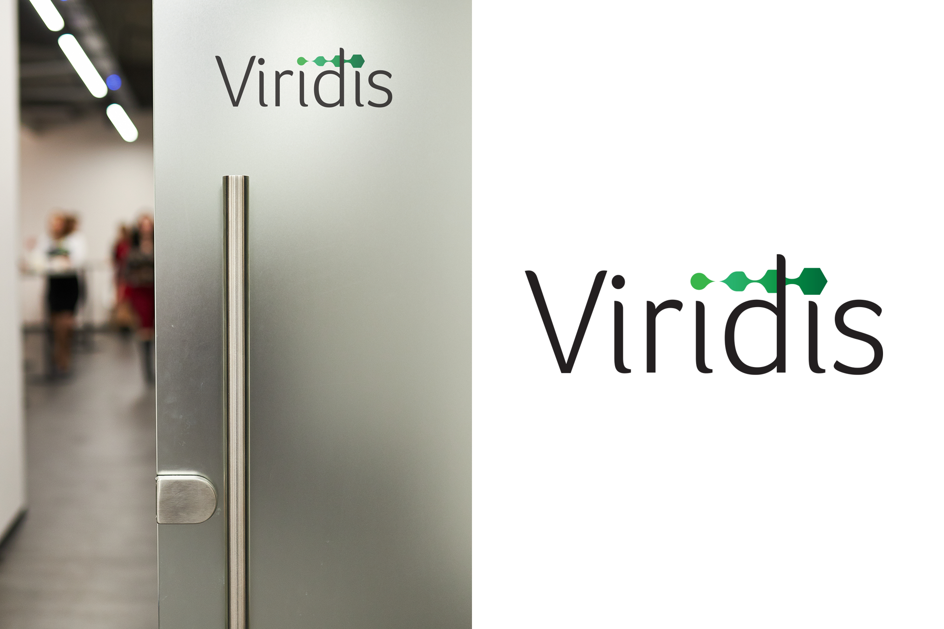
Created while I was with Texell Credit Union, this logo was developed for an internally built banking software platform. The customized wordmark incorporates a sequence of connected green forms that communicate data flow, connection, and forward movement — reflecting the system’s purpose as a real-time branch analytics tool.
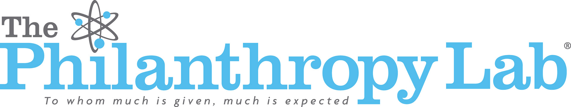
Created for a collegiate philanthropy class where students receive a grant and must develop a case for donation, this logo balances academic credibility with social impact ambition. The atom-inspired symbol implies thoughtful analysis and creative energy, positioning the program as both scholarly and mission-driven.
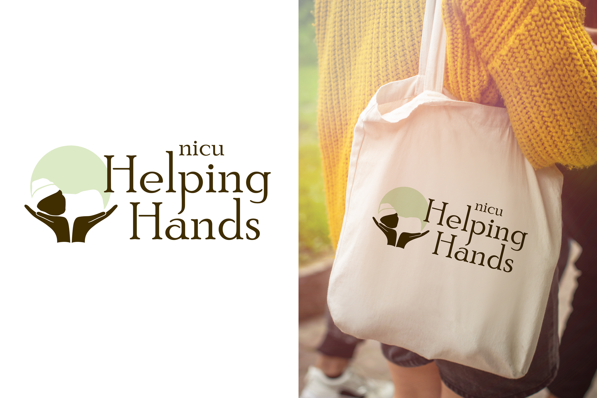
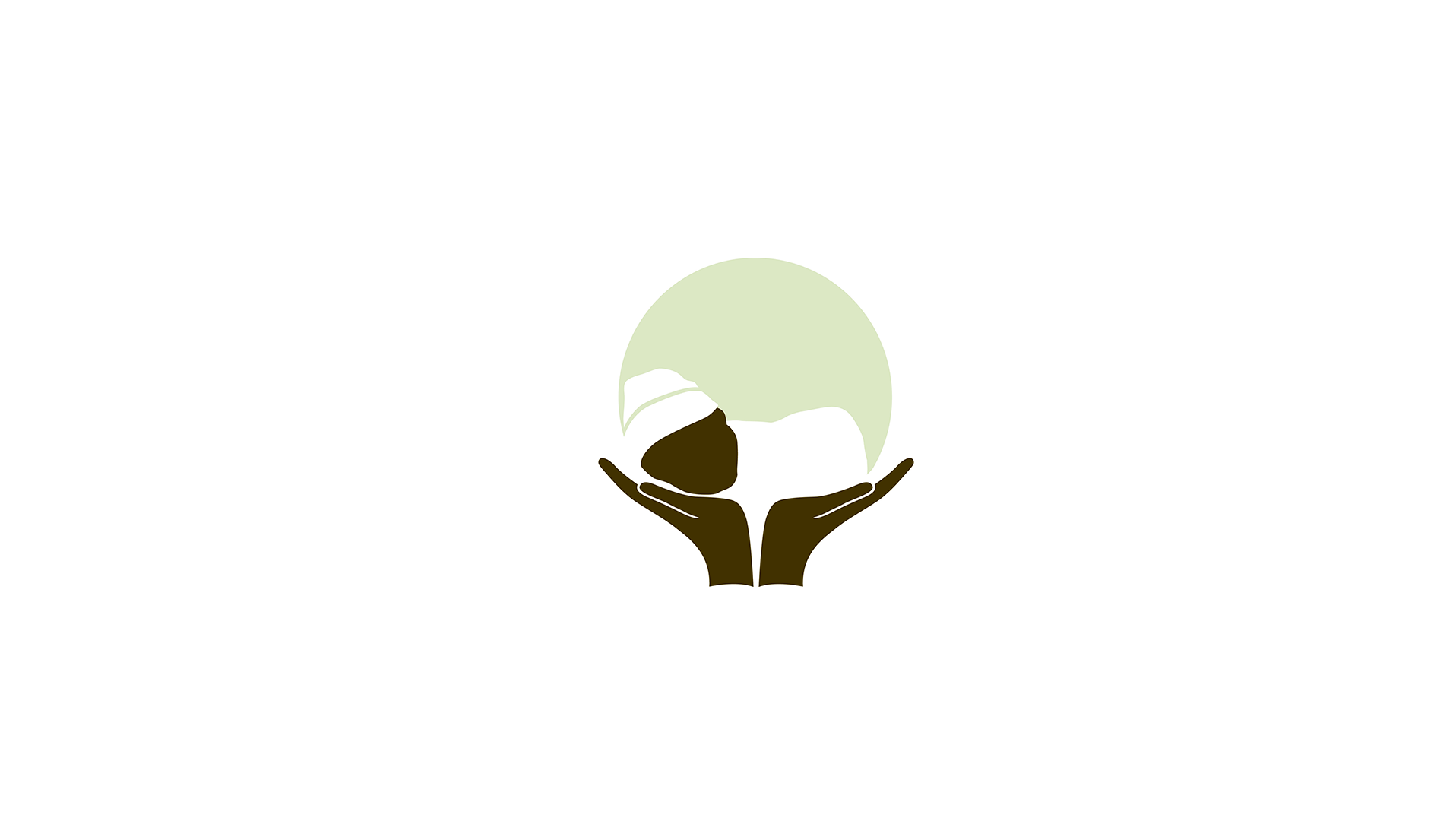
Created for a nonprofit supporting families experiencing NICU stays and infant loss, this logo centers on a stylized infant held within open hands to convey comfort, care, and dignity. The soft palette and classic typography reinforce the organization’s warm, compassionate mission.
Created for a research-driven program focused on evidence-based treatment of childhood apraxia of speech, this logo pairs a strong serif wordmark with a child profile silhouette to convey clarity, support, and clinical credibility. The structured typography and soft gradient reflect the program’s focus on both scientific rigor and meaningful outcomes for children and families.