The Project:
My team was asked to design a T-shirt for the TEA cohort to wear during their professional development session and the Global Training Summit in Austin. The shirt would be part of the cohort’s swag bag and needed to feel strong, professional, and appropriate for an adult audience. The initial request suggested using a flag or a word collage inside the shape of Texas.
Early Concept Exploration
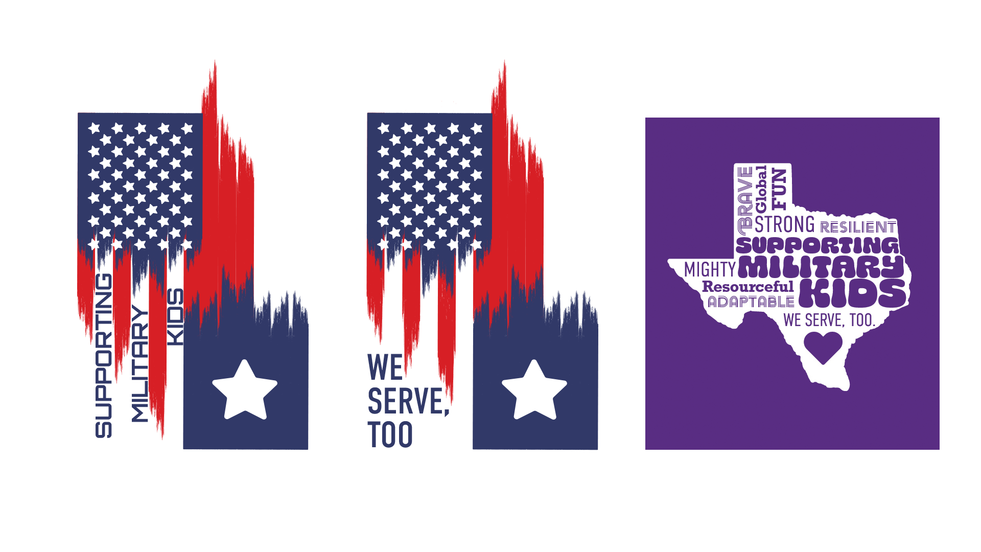
The first concept featured a motif that blended elements of the U.S. and Texas flags using sharp vertical stripes. While visually striking, it felt severe and unintentionally political. Because the cohort’s identity needed to remain apolitical, I guided the team away from flag-based imagery and toward more neutral expressions of place.
The first concept featured a motif that blended elements of the U.S. and Texas flags using sharp vertical stripes. While visually striking, it felt severe and unintentionally political. Because the cohort’s identity needed to remain apolitical, I guided the team away from flag-based imagery and toward more neutral expressions of place.
This led to exploring a word-cloud treatment inside the Texas silhouette — a direction with conceptual promise that felt intriguing and unifying.
First Draft Feedback
The word-cloud concept introduced new challenges:
The word-cloud concept introduced new challenges:
• The filled Texas shape required heavy ink coverage that would make the shirt stiff and uncomfortable. The outline of Texas is iconic enough without interior texture.
• A balloon-style font appeared in the draft, creating a tone that felt playful and youthful — misaligned with the audience. This was to be a shirt for grown-ups.
I directed the team to remove the fill, simplify the mark, and rely only on our brand-approved typefaces. This ensured the design felt intentional, cohesive, and appropriate for the setting.
Second Draft Feedback
With the simplified form in place, another issue surfaced: The co-branding of MCEC and TEA felt randomly placed. I recommended integrating the logos more purposefully — either within the Texas silhouette or positioned confidently on the sleeves. This strengthened the hierarchy and clarified the partnership.
With the simplified form in place, another issue surfaced: The co-branding of MCEC and TEA felt randomly placed. I recommended integrating the logos more purposefully — either within the Texas silhouette or positioned confidently on the sleeves. This strengthened the hierarchy and clarified the partnership.
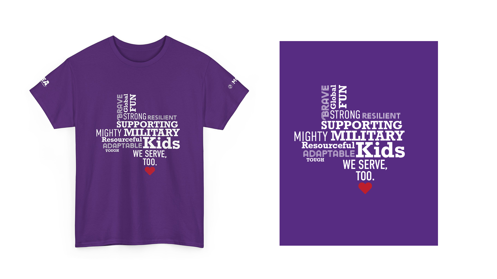
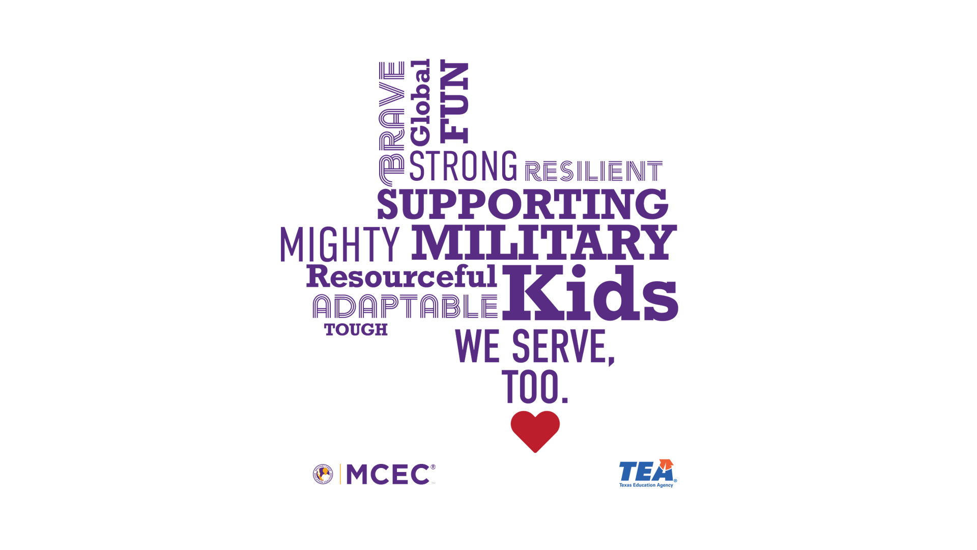
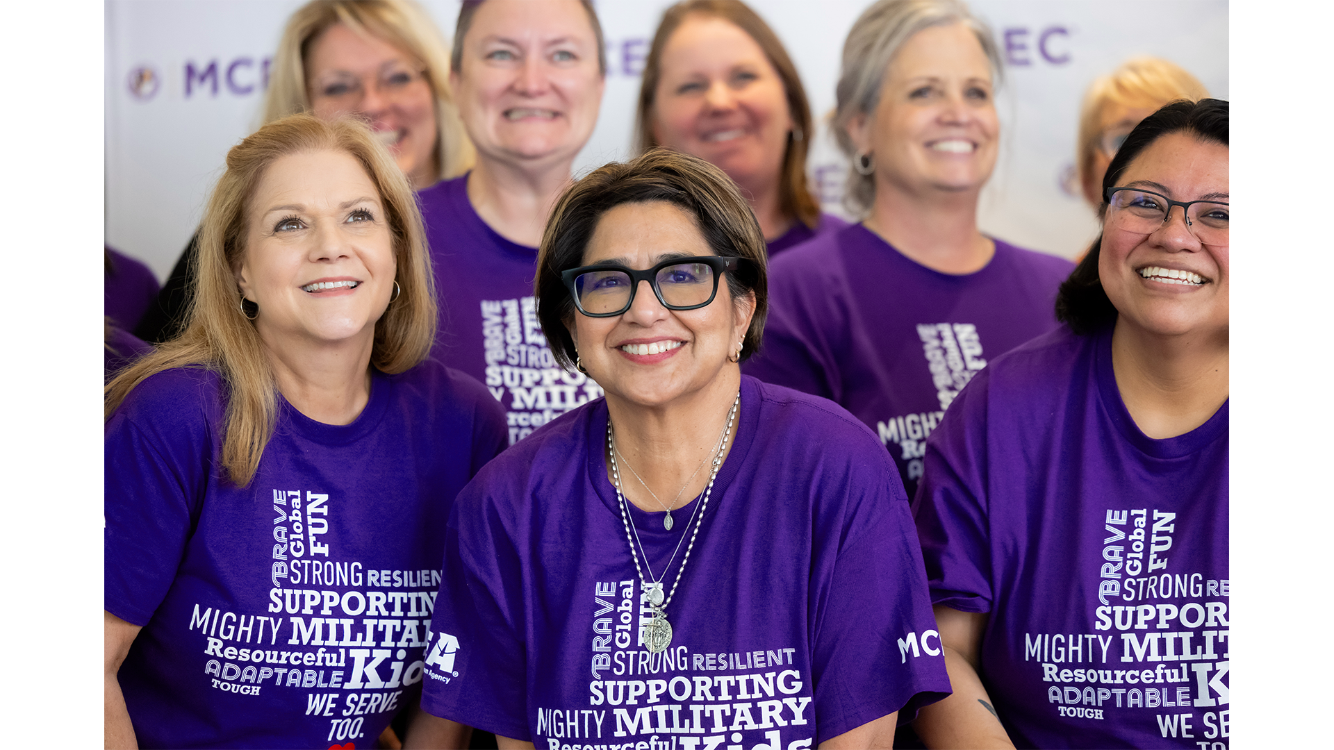
Final Approved Design
The final shirt delivered:
The final shirt delivered:
• a clean, iconic Texas outline
• typography aligned with MCEC’s system and appropriate for an adult audience
• apolitical design choices that supported inclusivity
• intentional co-branding placement
• a comfortable, wearable print with strong visual presence
• typography aligned with MCEC’s system and appropriate for an adult audience
• apolitical design choices that supported inclusivity
• intentional co-branding placement
• a comfortable, wearable print with strong visual presence
The result was a polished, strategic design that attendees loved — one that set the right tone for the TEA cohort and supported the collaborative spirit of the Global Training Summit.
Graphic design by Netta Killian